It is easy to overlook Llandygwydd, a cluster of Victorian cottages on a minor road off the A484 east of Llechryd in the Teifi valley. Its graveyard contains members of some significant local families from the nearby gentry houses of Blaenpant, Penylan, Noyadd Trefawr and Stradmore. But of the church there is now little trace except for its font, wreathed in brambles and standing incongruously in the open air. This is of itself surprising. Fonts are a bit of a problem for the church – it is generally unacceptable to re-use them as garden ornaments, and strictly speaking even the fragments of a broken font should be preserved within the church. Thus it is more usual to see superfluous and disused fonts from demolished churches sitting in the porch of an extant church in the neighbourhood.
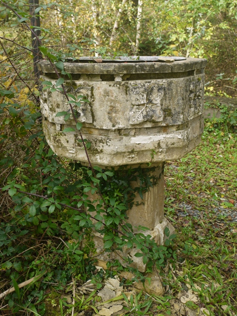
The font at Llandygwydd stands out of doors on the footprint of the nineteenth century church
The church which until 2000 gave it shelter was a Victorian one, built to a design by the high church architect RJ Withers, in 1856-7. Its fortunes, from construction to demolition have been recorded in detail by Gwynfor Rees in the journal Ceredigion Vol. XIV, no 4, 2004. The local gentry, especially the Webley Parrys of Noyadd Trefawr and the Brigstockes of Blaenpant were staunchly Anglican at a time when Nonconformism was growing among the local people, and it was felt important that the existing parish church,(a humble structure built in 1804 to replace a late medieval one on the same site), should be replaced by a structure of Victorian splendour, commensurate with the fashionable style of the neighbouring recently-enlarged mansions. It is recorded that the little ‘calling bell’ dedicated to St Peter, and the font, both of 15th Century origin, were incorporated into the new church. Most uncharacteristically for these parts, it was to boast a tower on the south side, surmounted by a tall timber steeple.
Over the following years the gentry families vied in endowing stained glass windows, an ornate reredos, a Caen stone and granite pulpit, and installed commemorative plaques recording their largesse. The church was said to have some of the finest stained glass in the county. In 1891 five new bells donated by the Webley Parry family of Noyadd Trefawr and Maria Brigstocke of Blaenpant in commemoration of the marriage of her niece joined the old bell from the former church.

Maria Brigstocke stands in the centre behind the five new bells. On the left side of the picture is the old bell dedicated to St Peter, from the original medieval church. see Ceredigion Archive
Sadly this impressive church had been built at ‘an extraordinarily cheap rate’ and proved structurally unsound, the timber steeple warped and bent, and the tower, set on insufficient foundations, cracked alarmingly. Within twenty years it was deemed unsafe to ring the bells lest masonry fall from the edifice, and a survey by church architects Caroe and Passmore in 1913 predicted that the bent spire might collapse onto the chancel at any time. That year the spire was removed, and the tower strengthened, but to no avail. In 1978, after several structural reports, the bells were sold to the foundry which produced them and in 1980 the entire tower was taken down.
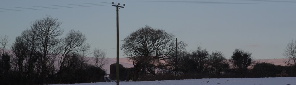
The church was de-consecrated and demolished in 2000, leaving its foundations and some mature yew trees among the graves. In situ inside what was once the south door, stands the font.
It might be speculated that at the time of demolition the Llandygwydd font was perceived as mid-Victorian, of no great historic importance and therefore allowed to stand as a landmark in the footprint of the church. But closer inspection reveals this to be far from the truth. This is a large medieval font carved out of Dundry stone from near Bristol, a source of good carve-able stone which was worked out by the sixteenth century. It is in the perpendicular style, with an octagonal base and bowl carved with a repeating four-leaved relief. But Mr Withers and his masons have embellished it. They sliced it into three horizontal layers and re-assembled them like a club sandwich with a narrow layer of oolitic limestone from Painswick between each. At the same time they repaired, as is common in old fonts, the various damages to the rim and stem with inset pieces of Painswick stone, quite different from the original Dundry. Resplendently reassembled and about four inches taller, it would have had a fashionably polychromatic appearance, with the yellow-brown Dundry stone layered sandwich style with white oolite.
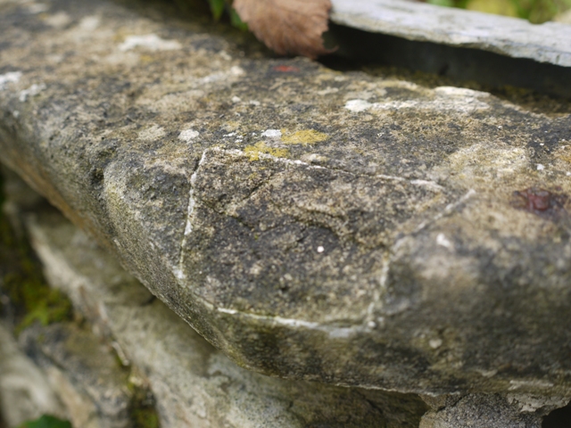
A later repair to the rim of the font
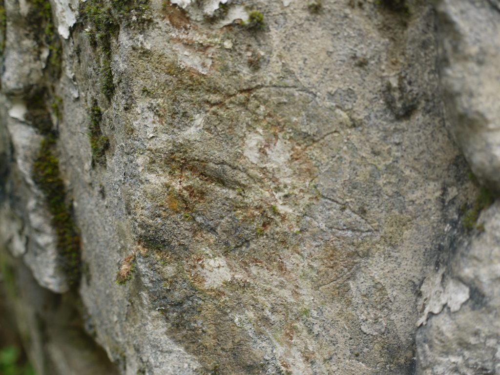
Today, forlorn and exposed to the weather, the newer courses of Painswick stone are badly weathered, and some of the inset repairs are falling out. Chunks are crumbling away from the Dundry stone stem. Moss and lichen colonize the surfaces, but as a further reminder of its antiquity, the close observer will find two daisy wheel patterns (a common medieval graffiti) lightly engraved upon the bowl.
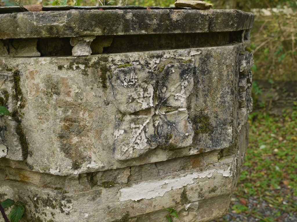
The layers of Paiswick stone have weathered away to leave deep grooves. To the left of the four leaf carving are two daisy wheel compass-scored devices on the medieval stone
I am intrigued at these devices. The expert belief is that they are symbols to ward off witches or the devil. They are very commonly found on fonts and the doorway arch or porch of ancient churches, though they may be found in more remote parts of the building too. The six petal form is easy to scratch with a compass or perhaps a pair of shears. You just score a circle, and then with one point on the circumference draw an arc within the circle till it touches the circumference again. Then move the point to the intersection of arc and circle and repeat. Soon six neat petals are inscribed within the circle.
The daisy wheel design
They are lightly scratched, not typical of serious masons’ work and anyone could have done them. I do wonder though whether the evidence for their role in repelling witches is a modern over-interpretation of past behaviour.
Equipped with a geometry set we all used to draw this device on our schoolbooks, because we could, and because without any great skill we could produce perfect symmetry. When bored we often coloured them in too. Will future historians conclude that 20th century schoolchildren all worked to repel the forces of evil during geometry lessons? The scholarly name for these devices on medieval structures is apotropaic graffiti. But for me and my schoolfriends the same images were meaningless, but very satisfying, doodles.